Style · 13 min read
Pashmina Shawl Colours: How to Choose a Shade
Pashmina shawl colours: how to choose a shade by undertone, skin tone, winter light and wardrobe, with a shortlist from the 279-shade solid range.
By Timothy V. Manley
7 November 2026
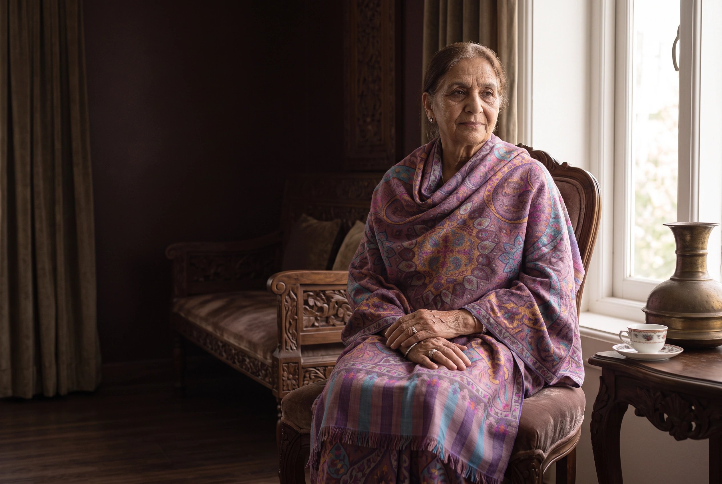
Pashmina shawl colours are chosen twice: once in the shop, under one light, and again every morning in front of a wardrobe. Begin with undertone and the light you will wear the piece in, narrow to a shade family, then compare close neighbours on the 279-shade card rather than choosing between a hundred strangers.
A solid pure pashmina shawl has no pattern to hide behind. The colour is the design, and a shade that looked rich under a shop lamp can turn flat at a north-facing window or harsh under an office downlight. This guide is written to make the decision smaller: from a card of 279 colours to a family, then to five or six candidates, then to one. It assumes you are buying cloth to wear rather than a colour to photograph, and it treats the shade card as a working tool rather than a menu.
Why colour behaves differently on pashmina
Pashmina is defined by its fineness. The registered Kashmir specification sets a ceiling of 16 microns for the fibre, with hand-spun yarn and handweaving [2], and the wider cashmere family is defined by a mean fibre diameter of 19 microns or less, with variation capped at 24 per cent and no more than 3 per cent of fibres above 30 microns [1]. Fine fibre means a large number of filaments in a small volume, and that has consequences for colour.
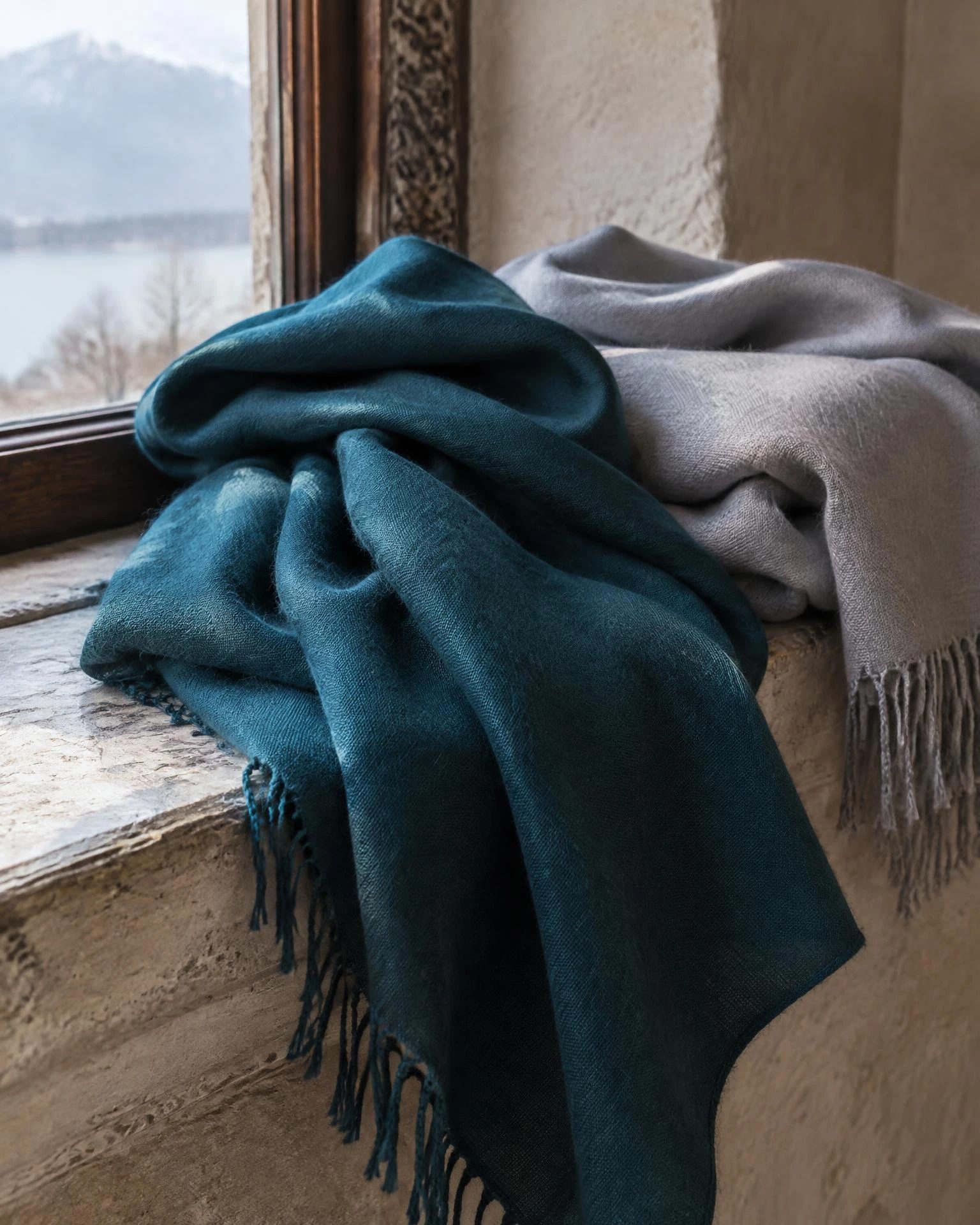
The first is that dye sits on a very large surface area relative to the weight of the cloth. In our experience, a fine pashmina takes a shade evenly and deeply, which is why a solid piece can look almost liquid in the hand. The second is that the cloth has a slight lustre. Lustre does not change the pigment, but it changes the way light leaves the surface: the same shade appears lighter across a fold and darker where the cloth hangs flat, so a shawl in motion reads differently from a shawl laid out.
The third consequence is that pale and deep shades reveal different things. A deep navy or madder shows the drape and the lustre, and it hides the small irregularity of a hand-spun weft. An ivory or pale grey shows the weave, the selvedge and every mark. Neither is better; they are different instruments. If you want to see the cloth, choose pale. If you want to see the colour, choose deep.
Undertone and overtone, in plain terms
The overtone is the colour you would name: navy, gold, rose. The undertone is the cast beneath it: whether that navy leans blue-black or green-black, whether the gold leans yellow or bronze. On a matte wool the difference is subtle. On pashmina, where the surface carries a little light, the undertone is often what you actually notice across a room.
There is a simple way to see it. Put the shawl on a sheet of plain white paper in daylight and look at the edge where cloth meets paper. Then hold it against your forearm. The paper shows the overtone; the skin shows the undertone, because skin reflects warmth back into the cloth. A shade that looks correct on paper and dead against your hand will usually look dead against your face.
Undertones are usually grouped as warm, cool or neutral. Warm shades carry yellow, orange or red; cool shades carry blue, green or violet; neutral shades sit between and are hardest to name and easiest to wear. The grouping is a language for comparison, not a law of nature. Two olive greens can sit on opposite sides of it.
Skin tone, and the limits of the test
Most colour advice begins with a test: look at the veins on your wrist, decide whether they are blue or green, and accept the label that follows. The test is a shortcut, and a rough one. Veins show through skin, not beside it, and the answer changes with the light in the room, the temperature of your hand and the colour of whatever you are wearing.
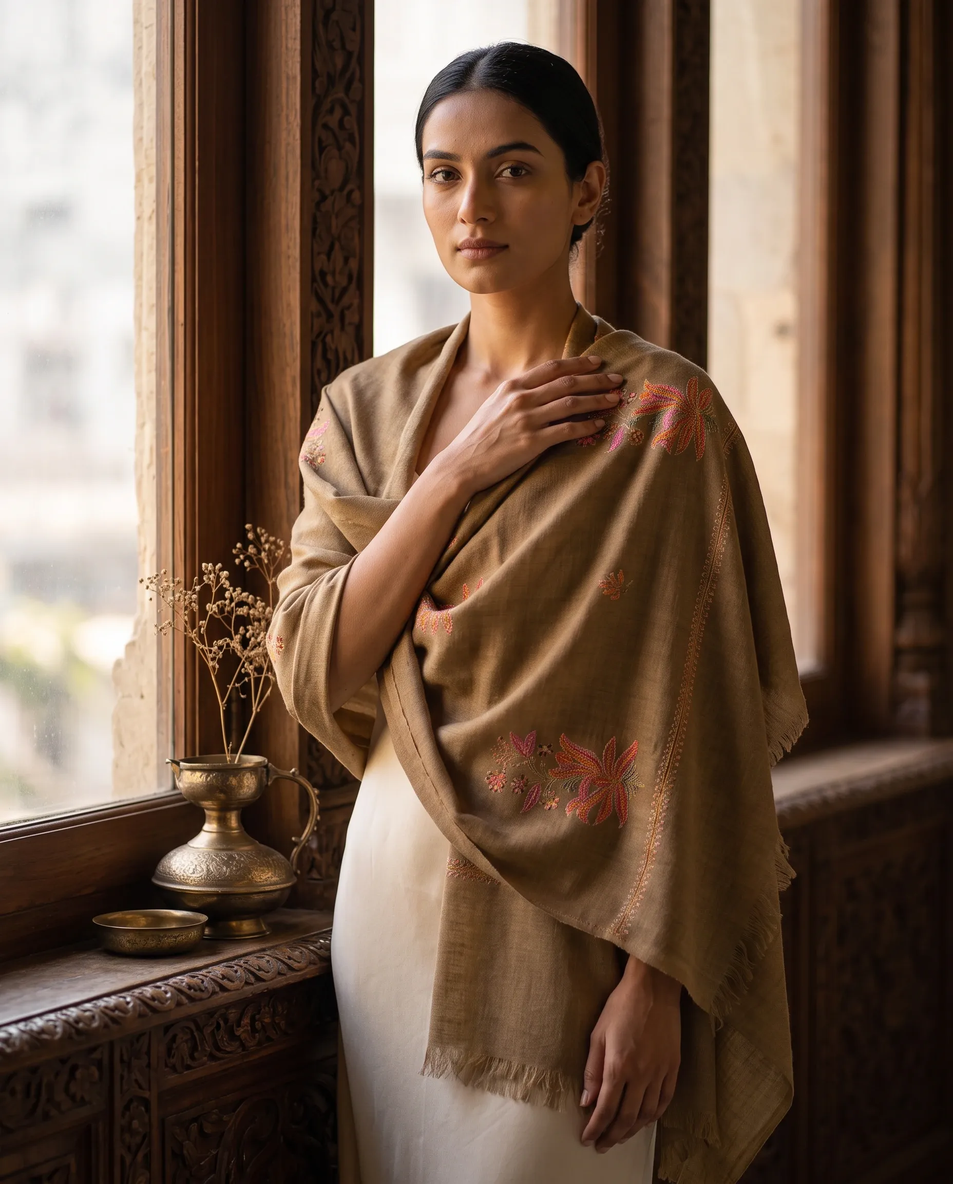
A better method costs a minute. Sit at a window in daylight, hold the shawl under your chin and look at your face rather than at the cloth. A shade that suits you tends to even the skin and soften shadows; a shade that does not tends to emphasise redness, sallowness or the darkness under the eyes. The effect is easier to see than to argue about, and it works whether or not you can name your undertone.
Tendencies are still useful as a starting point. Warm complexions often carry saffron, rust, bronze and the madder reds well. Cool complexions often carry lilac, the lake blues, teal and charcoal. Neutral complexions can wear most of the card, which is another way of saying they need the face test more than the theory. Hair and eye colour matter less than the contrast between hair and skin: high contrast usually carries deep shades and clear ivories, low contrast usually carries mid-tones and soft neutrals.
Two cautions. Grey and white hair changes the calculation, because ivory and pale grey can either flatter it or disappear into it; hold the swatch beside the hair, not only the face. And a tan is a temporary variable: a shade chosen on holiday may read differently at home in February.
How pashmina shawl colours read in winter light
Northern winters are not neutral. The sun sits low, overcast days throw a blue-grey cast, and indoor light swings between warm tungsten and cool LED. Under that mix, ivory drifts towards grey, navy can read as black, and a warm madder can lose its red and look brown. A shade that was chosen in summer sun may arrive in November looking like a different colour.
The practical response is to test at the hour you will actually wear the piece. If most of your wearing happens on a commute before eight in the morning, look at the swatch at that hour. If it happens at dinner, look at it under the lamp you eat by. Daylight is the reference, not the target.
Photography adds a second layer of distortion. A phone camera will warm or cool a shade depending on its white balance, and a screen will render it depending on its own calibration. The shade card on a website is indicative by design; the hex values behind it describe a screen, not a dyed shawl. When the colour matters, ask for a physical swatch, or ask for the piece to be photographed beside something with a known colour.
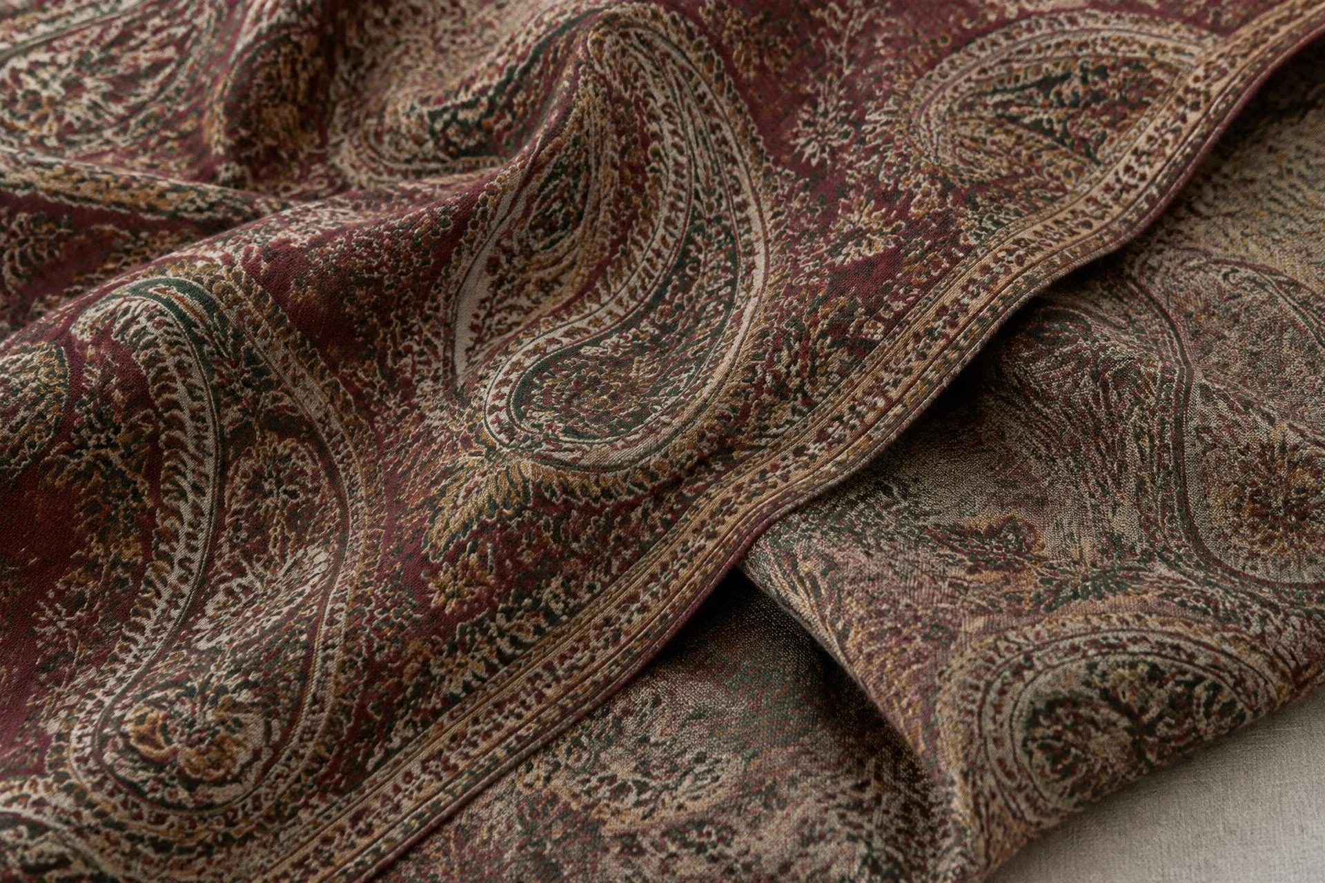
This is also where the historical shawls are instructive. The Victoria and Albert Museum's nineteenth-century Kashmir shawl has a plain undyed centre with woven borders in panels of different colours [3]. The colour was concentrated at the edge, where it met the light and the eye, while the field stayed close to the fibre's own tone. A modern solid reverses that logic, but the lesson holds: colour is read at the edge, in movement and against the face.
A wardrobe audit before the shade card
Before opening the shade card, count what you own.
Start with coats and jackets, because they set the frame. A camel coat wants depth or contrast; a black coat wants either a clear ivory or a saturated colour; a navy coat wants warmth, since a second blue can look like a uniform. Then count the metals you wear: gold jewellery pulls a wardrobe warm, silver pulls it cool, and a mixed habit gives you the whole card. Then name the three pieces you wear most and the two you never wear, and ask what the unworn two have in common. It is usually a shade that was bought for an occasion rather than a life.
The rule we suggest is the rule of two: a new shade should work with at least two pieces you already own, one of them outerwear. A shawl that needs a new wardrobe is a shawl that stays in the drawer.
Finally, decide the piece's job. A daily shawl needs a shade that survives repeated wear, travel and dry cleaning. An evening piece can be more saturated. A wedding piece has its own constraints. The same card serves all three, but not the same corner of it.
The ten shade chapters
Our card is arranged in ten chapters, each running from light to deep, so that neighbouring shades can be compared rather than scattered. Ivories and Undyed begin with the colour of the fibre as it leaves the comb: cream, milk and the faintest grey. Saffron and Gold run from pale gold to old brass. Chinar Ember holds peach, orange and rust, the colours of a Kashmiri autumn. Rogan and Rose move through garden roses to the deep madder reds of the old workshops. Wild Iris collects lilac, mauve and violet.
The second half of the card is cooler and deeper. Dal Lake begins with morning sky on still water and ends in the navy of the lake at night. Jhelum Teal runs through mint and turquoise. Pine and Chinar Leaf holds meadow greens, sage and olive through to dark pine. Walnut and Earth covers tan, khaki, taupe and bronze. Smoke and Slate closes with woodsmoke greys and charcoal.
The order is the point. Choosing between 279 scattered colours is impossible; choosing between six neighbours in one chapter is a decision you can make in daylight in a few minutes.
Shade family · Undertone · Best for · Risk
- Ivories and undyed Undertone: Neutral; Best for: First piece, summer, bridal; Risk: Shows marks; can read grey in winter light
- Saffron and gold Undertone: Warm; Best for: Festive wear, warm complexions; Risk: Turns yellow under some LED light
- Chinar ember and madder Undertone: Warm; Best for: Autumn wardrobes, camel and brown coats; Risk: Close to some skin tones; low contrast
- Wild iris Undertone: Cool; Best for: Cool complexions, spring evenings; Risk: Can look washed out in flat daylight
- Dal Lake blues Undertone: Cool; Best for: Most wardrobes, evening, men's wear; Risk: Navy reads as black indoors
- Teal and pine greens Undertone: Cool to neutral; Best for: Statement pieces, travel; Risk: Harder to pair with warm coats
- Walnut and earth Undertone: Warm neutral; Best for: Everyday wear, cream and khaki; Risk: Can look drab in grey weather
- Smoke and slate Undertone: Cool neutral; Best for: City wardrobes, tailoring, travel; Risk: Shows lint and pressing sheen
Five shortlists
If you want a starting point rather than a theory, these five groups cover most wardrobes. They are drawn from the chapters above, not from a separate range.
The neutral five: undyed ivory, cream, pale grey, taupe and charcoal. This is the group that works with everything and photographs badly, because neutrals are the hardest shades for a camera to render honestly.
The warm five: pale gold, saffron, rust, madder red and bronze. These reward a wardrobe with camel, brown, cream or olive in it, and they are the shades most likely to be chosen for a winter wedding.
The cool five: lilac, sky blue, navy, teal and slate. Navy and slate do most of the work here, and they are the two shades we are asked for most often by men choosing a first piece, as the guide to pashmina shawl for men explains.
The statement three: deep teal, madder and a saturated saffron. Each is a decision rather than a default, and each needs a wardrobe that can take it.
The bridal three: ivory, off-white and pale gold. Ivory is rarely a pure white, which is useful when the dress is; pale gold flatters in candlelight and photographs warmly.
Two of these groups connect to other guides. If you wear an abaya, the pashmina abaya guide sets out tonal and contrast strategies that change which shades are worth considering. If the piece is a present, the pashmina shawl gift guide starts from the recipient's wardrobe rather than from the card. If two shades are still neck and neck, we can photograph them together in daylight; ask through a private client appointment appointment.
Living with a dark shade
Deep shades are more forgiving in matching and less forgiving in handling. Charcoal, navy and madder show surface lint, pressing sheen and the faint light line left by a fold. They also show water marks, which is why a spill should be blotted rather than rubbed and the piece washed whole rather than spot-cleaned.
Handle dark shades with clean hands and store them flat, interleaved with acid-free tissue, so that a crease does not become a shine. Steam rather than press, and keep the iron off the cloth. Perfume and hairspray should go on before the shawl, not after, and the shawl should be aired after a long evening before it is folded away.
None of this is a reason to avoid dark colours. It is a reason to buy them with the care routine in mind. The last judgement belongs to daylight and your own wardrobe. If you would like to see the range in hand, where to buy explains how private enquiry works.
Questions we are asked
Which pashmina colour suits everyone?
None does, but ivory and charcoal come closest. Both sit at the ends of the card, both work with most wardrobes, and both are easy to test against the face. If you want a first piece and cannot decide, choose one of those two and learn how you wear it before adding colour.
Should the shawl match my coat or my outfit?
Match the coat if the shawl will mostly be worn outdoors, because the coat sets the frame. Match the outfit if the shawl will mostly be worn indoors, because the coat comes off. If both matter, choose a shade that sits between them rather than repeating either exactly.
Will the shade on my screen match the shawl?
Not reliably. Screens differ, cameras adjust white balance, and dyed fibre has a lustre that no flat colour value captures. The card is a map, not a match. Ask for a physical swatch or a photograph taken in daylight beside a neutral reference.
Is black a practical choice?
Black is the most forgiving shade to match and one of the least forgiving to maintain, because it shows lint, dust and pressing marks. If you want the effect of black with less maintenance, charcoal and the darkest navy give most of it and hide more.
Can a pale shawl be dyed a darker colour later?
It can be attempted, but we would not recommend it. The piece has already been spun, woven and finished, and re-dyeing puts the cloth through a second wet process for a result that may be uneven. If you want two colours, buy two pieces and keep each one's history intact.
Sources
- CCMI Definition of Cashmere, Fine and Superfine Wool. Cashmere and Camel Hair Manufacturers Institute, archived 23 May 2024 — Accessed 2026-11-07.
- Quality Manual for Enforcement of Kashmir Pashmina GI. Craft Development Institute, Srinagar, updated 2023 — Accessed 2026-11-07.
- Kashmir Shawl. Victoria and Albert Museum — Accessed 2026-11-07.